
Medium: Microsoft Word and Adobe Acrobat
Year Created: 2022
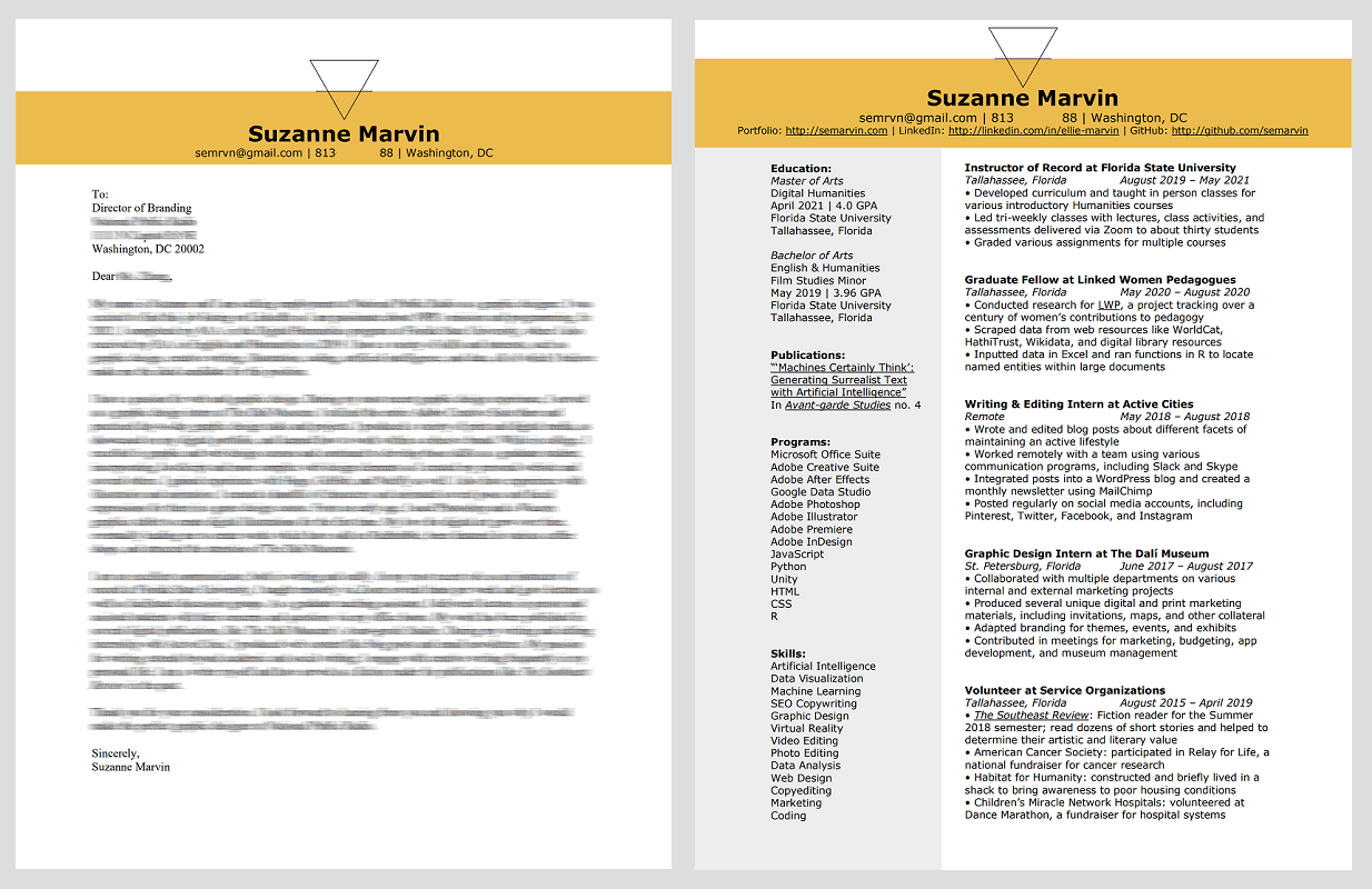
Process: I recently redesigned my resume to better match my design portfolio and created a matching cover letter template. As you can see from my old resume above, this version incorporates the bold strip of color at the top and better aligns my logo so that it is not taking up as much space. I updated the heading font to match the font I use on this site, though I kept the uppercase letters on my resume for a more professional look. This rebrand updates the section headers to a more current design look and features the links for my portfolio, LinkedIn, and GitHub right at the top so that they are easy to find.
Medium: Adobe Photoshop and Wacom Tablet
Year Created: 2020
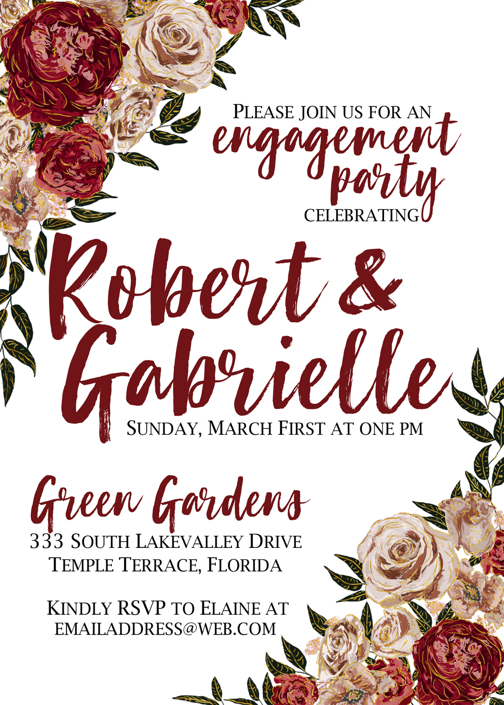
Process: I made this invitation for a couple celebrating their engagement. They sent me pictures of their color scheme and flowers. Together, we determined a few design ideas and decided that the flowers should be featured in the invitation. Using a similar style to this concert illustration which I completed in 2019, I hand drew each flower and leaf. I arranged them in opposite corners, with the upper corner more dominant. I added gold foil embellishments to really pull everything together. Finally, I added the typography. I selected a casual brush script because the party is not overly formal. It matches the style of both the party and the couple.
Medium: Adobe Photoshop and Wacom Tablet
Year Created: 2019
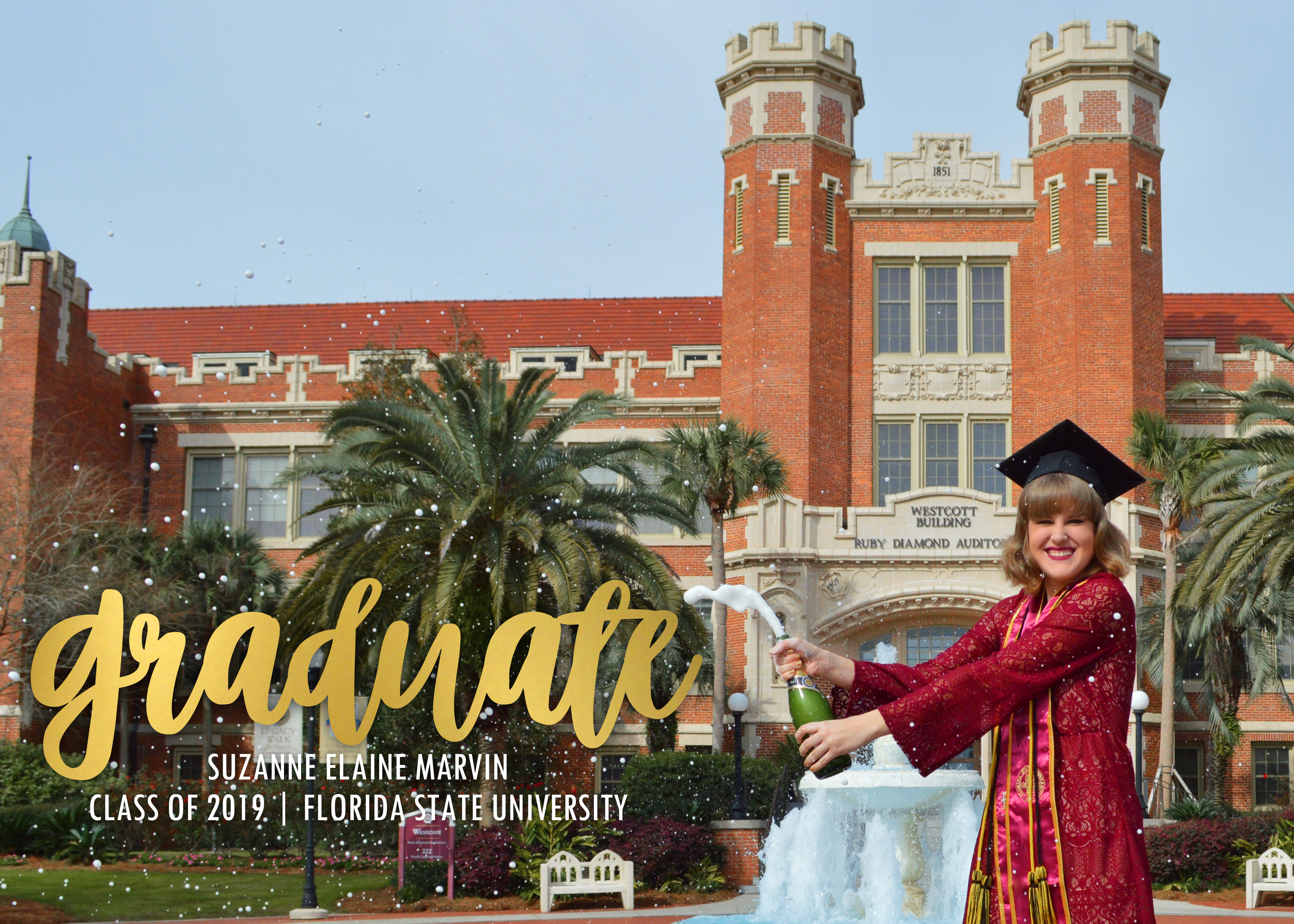
Process: I created this graduation announcement to send to my friend and family when I graduated from undergrad. I used a gradient to fake a gold foil look on the 'graduate' header and a clean, classic font for the rest to echo the font on the building behind me. I used bright, bold colors to tie the whole design together.
Medium: Adobe Photoshop
Year Created: 2017
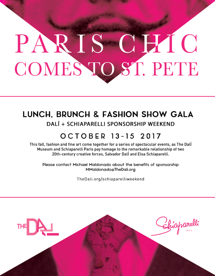
Process: I completed this digital invitation for a sponsorship weekend consisting of a lunch and a fashion show to promote an upcoming exhibit which featured fashion designs and wearable art. I was provided the graphic elements and copy. I made major changes to the layout and created the heading. I modeled the heading after the mastheads commonly featured in a lot of the collateral produced at The Dali. Here's an example of a masthead:
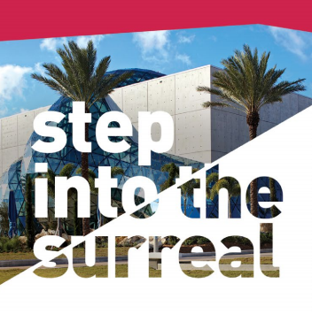
I mirrored the style of the text while maintaining the design trends of the exhibit's accompanying materials. In the end, a more traditional header style was chosen. However, I stand behind this version because it pushes the boundaries of the new exhibit's design features while mirroring The Dali's design trends.
Medium: Adobe Illustrator and Adobe Photoshop
Year Created: 2017
Process: The Dali Museum has an app which includes a list of all of the paintings in the Permanent Collection. However, sometimes some of those paintings aren't on view because they are either on loan to another museum or undergoing restoration, causing confusion and disappointment for some guests. To solve this problem, The Dali wanted to place icons over the paintings that weren't on view to indicate to visitors that these paintings were temporarily unavailable for viewing. The graphic design team created a plethora of options for both the "on loan" icon and the "restoration" icon. To the left is a mockup featuring some of the icons as they would appear on the app. The mockup was created in Photoshop and the icons were created in Illustrator. Below are some of the other icons that we produced. ![]()

Medium: Adobe Photoshop
Year Created: 2017
Process: I made this evite for a fashion show event. The text and design elements were provided, however I did have to alter the graphic at the bottom by adding and removing some butterfly graphics. I was given some liberty with the typogrphy on this project, especially in the header.
Medium: Adobe Photoshop
Year Created: 2017
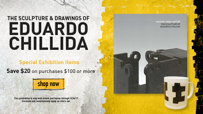
Process: I created this banner for use on The Dali's online store. It was used for the duration of the exhibit (about five months), but has since been changed out for a banner featuring the current exhibit's products. The banner was used to advertise discounted items. Many of the design elements were provided to me. I discussed the layout with many members of The Dali team. This GIF shows how the banner was displayed on the Museum's website.
Medium: Adobe InDesign and Adobe Photoshop
Year Created: 2017
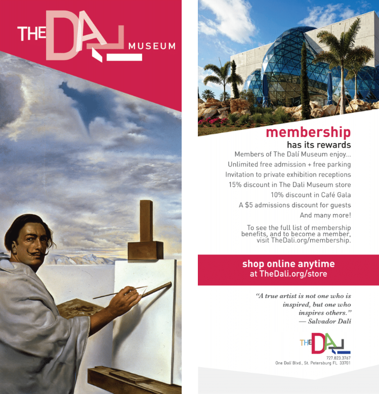
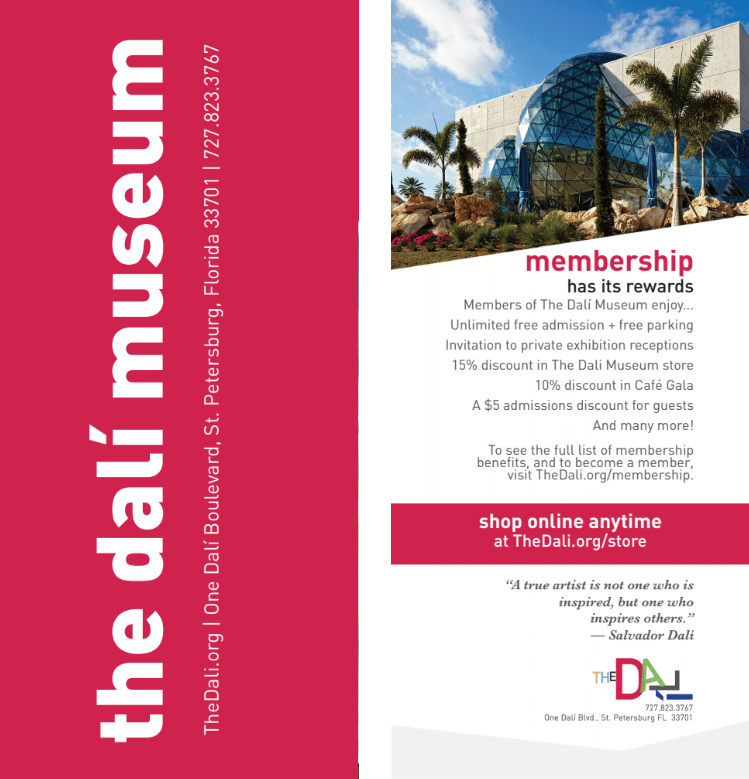
Process: During a collateral overhaul and redesign, I created these two bookmark concept designs. These bookmarks would be given away to customers who made purchases in The Museum gift store. They are souvenirs so that people can fondly remember their time at The Dali, but also be encouraged to come back or make more purchases at the online store. These images show both the front and back of the bookmark. The back is the same on both. It provides information about membership benefits and advertises the online store. The first bookmark's front shows off a portion of Salvador Dali's 1960 painting The Ecumenical Council. This part of the painting shows a self-portrait of Dali painting a smaller canvas. The second bookmark has a very simple front which features only text. It quickly and easily conveys all the information a guest might need to contact or revisit the Museum.
Medium: Adobe InDesign
Year Created: 2017
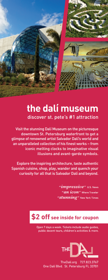
Process: I collaborated with several members of The Dali team to create this advertisement for a map of St. Petersburg. Together we chose which pictures to feature, which copy to include, which quotes to use, and how to arrange the layout. Although we debated the red background, we ultimately decided that the red was eye-catching and would stick out on a map with several other ads. Unfortunately, this ad was not printed until after my internship ended, so I only have its digital form.
Medium: Adobe Photoshop
Year Created: 2017
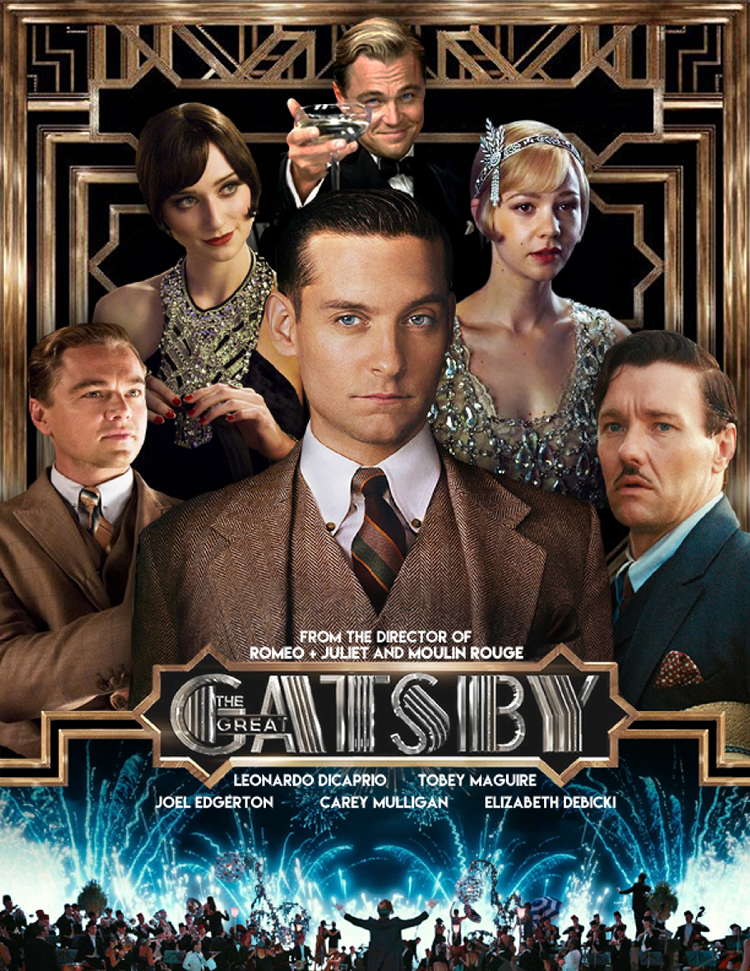
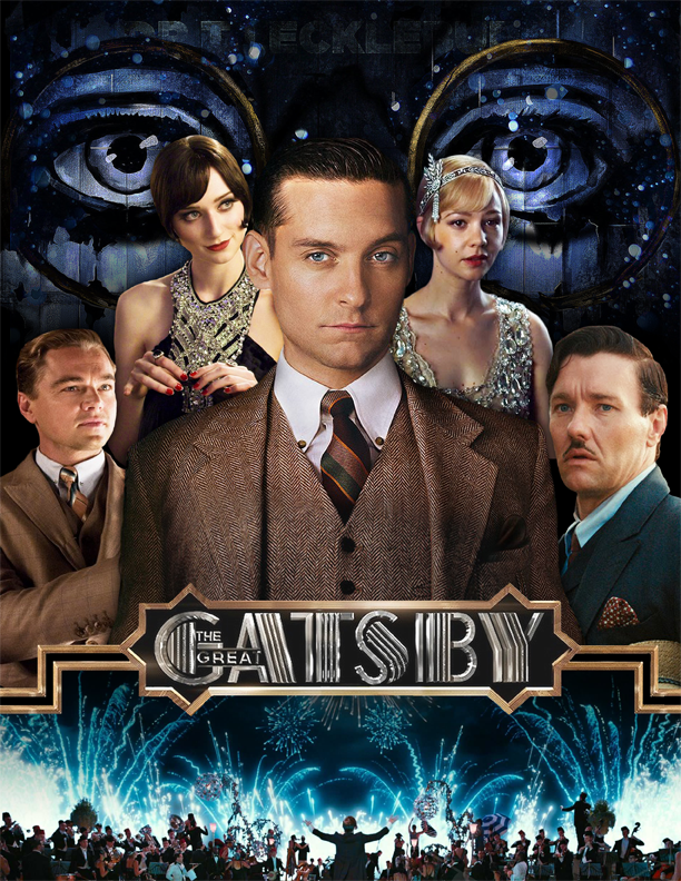
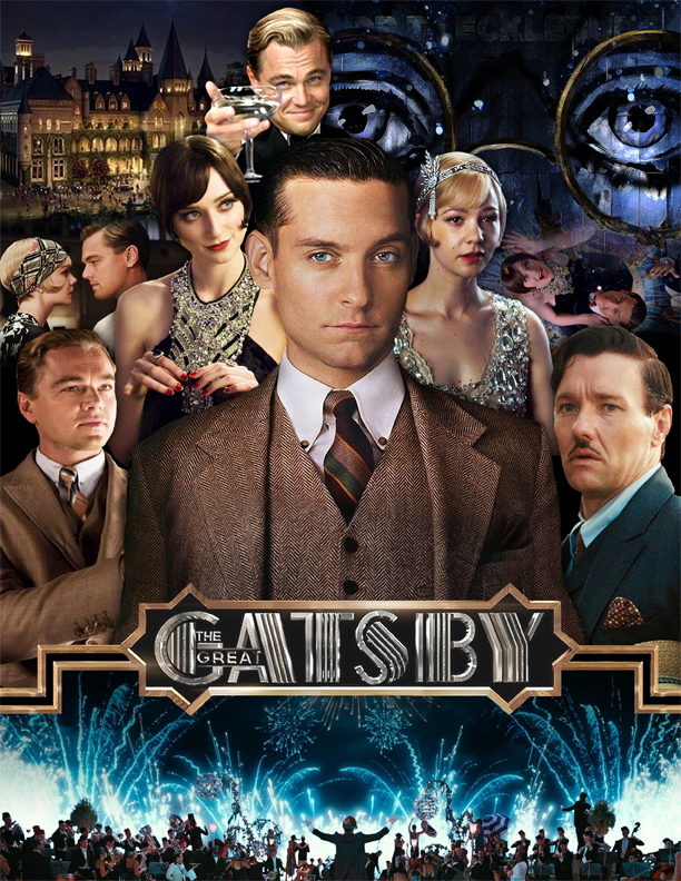
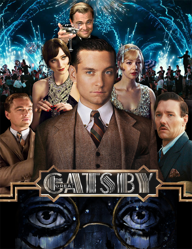
Process: I created this mock poster for the 2013 film The Great Gatsby in the style of Drew Struzan's movie posters from the '70s. I used the same font and many graphic elements from the official posters, and combined stills of the main characters in a pyramid style. This poster went through several drafting phases before I settled on this look. Some of those drafts are below. Originally, I wanted to compile warm colored images to the left of the character portraits, and cool colored images to the right; however, this created a very cluttered layout. I decided to use just two pictures in the background — the fireworks and the eyes of Dr. T. J. Eckleburg. Ultimately, I decided to keep the firework image below the movie's title and replace the eyes with the sleeker background from Gatsby's gate, creating an overall more cohesive image which was less overwhelming for the viewer.
Medium: Adobe Photoshop, Adobe Illustrator, Adobe InDesign and Wacom Tablet
Year Created: 2017
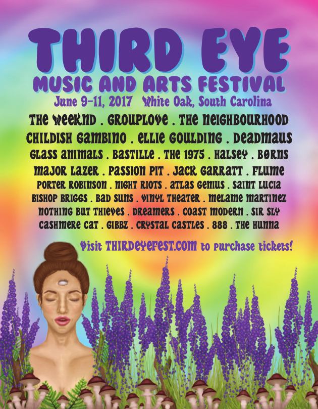
Process: I created this poster for Third Eye Music Festival, an imaginary music and arts festival of my own creation. The poster showcases an altered version of my own artwork, which I created in Photoshop with my Wacom graphics tablet. I made this poster in InDesign and the logo at the top of the page was made in Illustrator.
Medium: Adobe Photoshop
Year Created: 2017
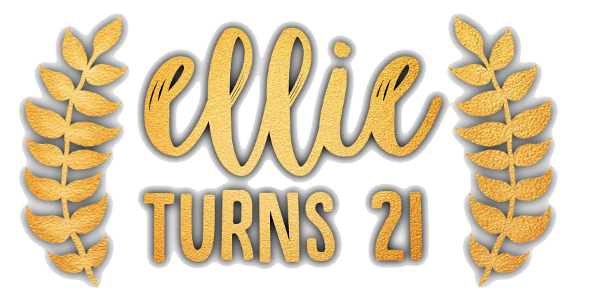
Process: For my 21st birthday party, I made and launched this Snapchat filter. It was placed at the bottom of the screen with no other decorations. The black, blurry shadow behind everything was necessary so that the filter stood out no matter what image it was placed on. Click here to see one example of the filter in action.
Medium: Adobe Illustrator
Year Created: 2017
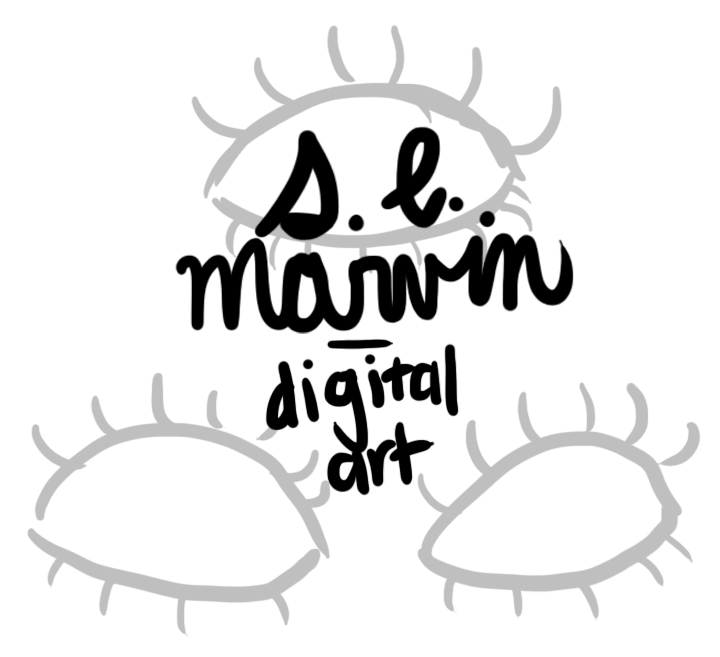
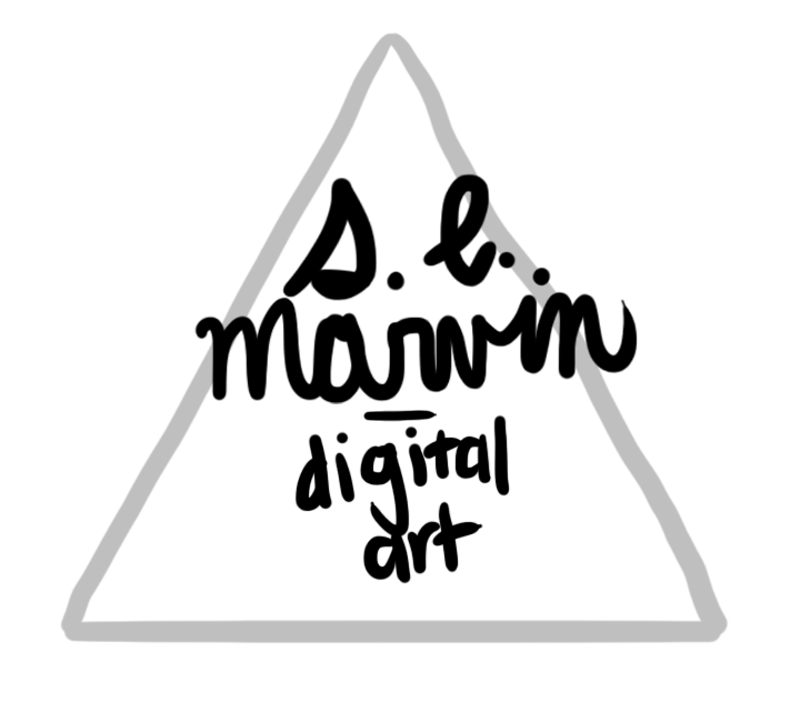
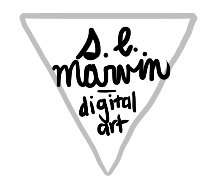
Process: I made this logo to promote my personal brand. I use it for my graphic design portfolio, as well as my artwork. The logo features an inverted triangle, a horizontal line, a script font, and a serif font. I had to edit the "s" in my name, as the original script had a highly stylized lowercase "s" that was hard to read. The triangle came from my original concept of using three eyes, a motif found in much of my artwork, which I later scrapped for the simpler triangle shape. My brainstorming process for this design can be seen below. I especially like this logo because the wording can be removed and it still conveys my brand. I use the copy-free version in small spaces, like my favicon for this site and on my resume. For this website, I created a gold variation of this logo, and a second gold variation which shimmers; this GIF can be seen at the bottom of every web page. I also made a scanning animation for the header of this website.

Medium: Adobe Photoshop
Year Created: 2016
Process: I created this logo for a client's shaved Hawaiian ice company. The client wanted something simple and sleek with a California skater feel and a wave somewhere in the logo. I made a wave vector to replace the A. For the colors, I used a tropical blue and a dark red, as requested by the client.
Medium: Adobe Photoshop
Year Created: 2017
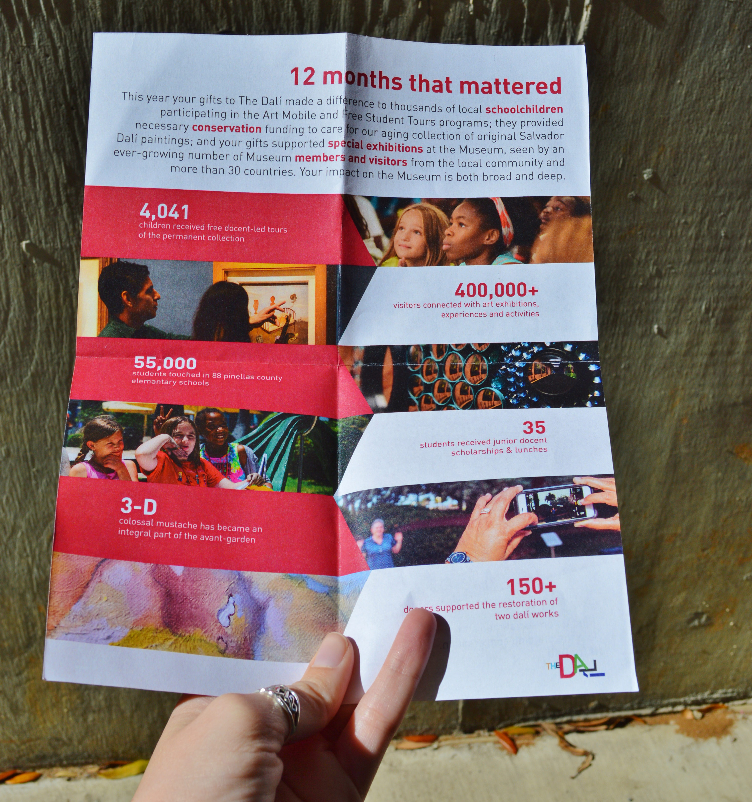
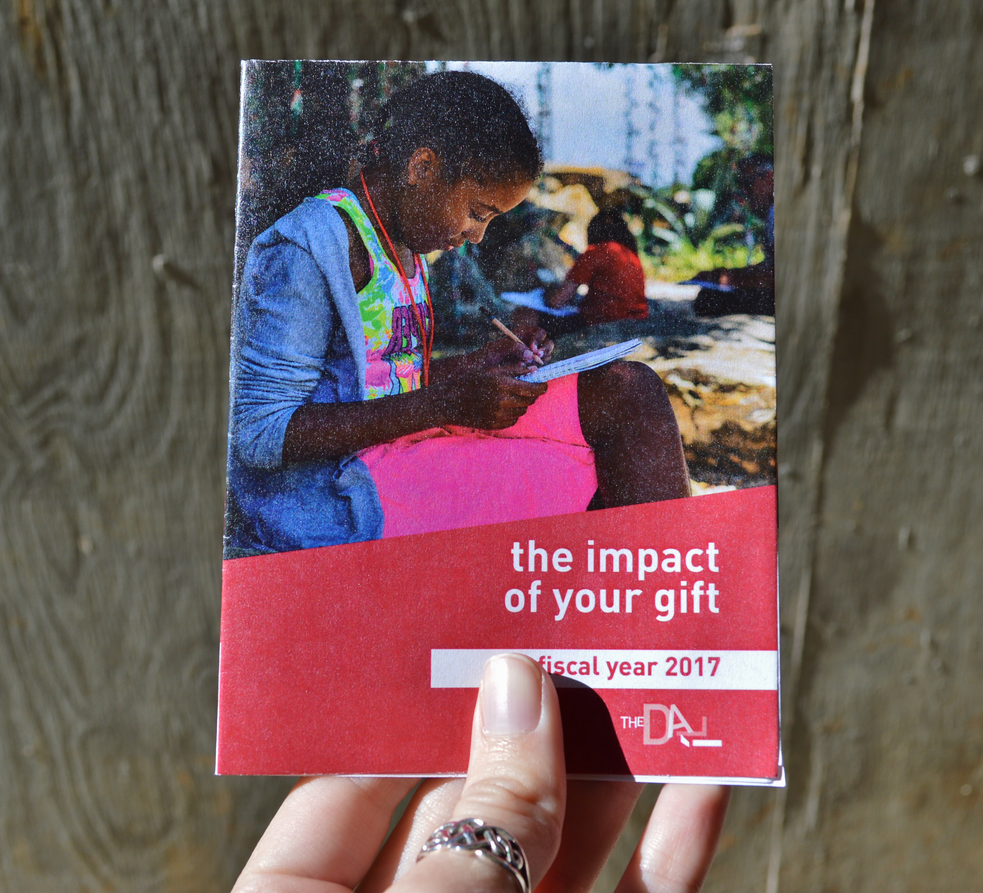
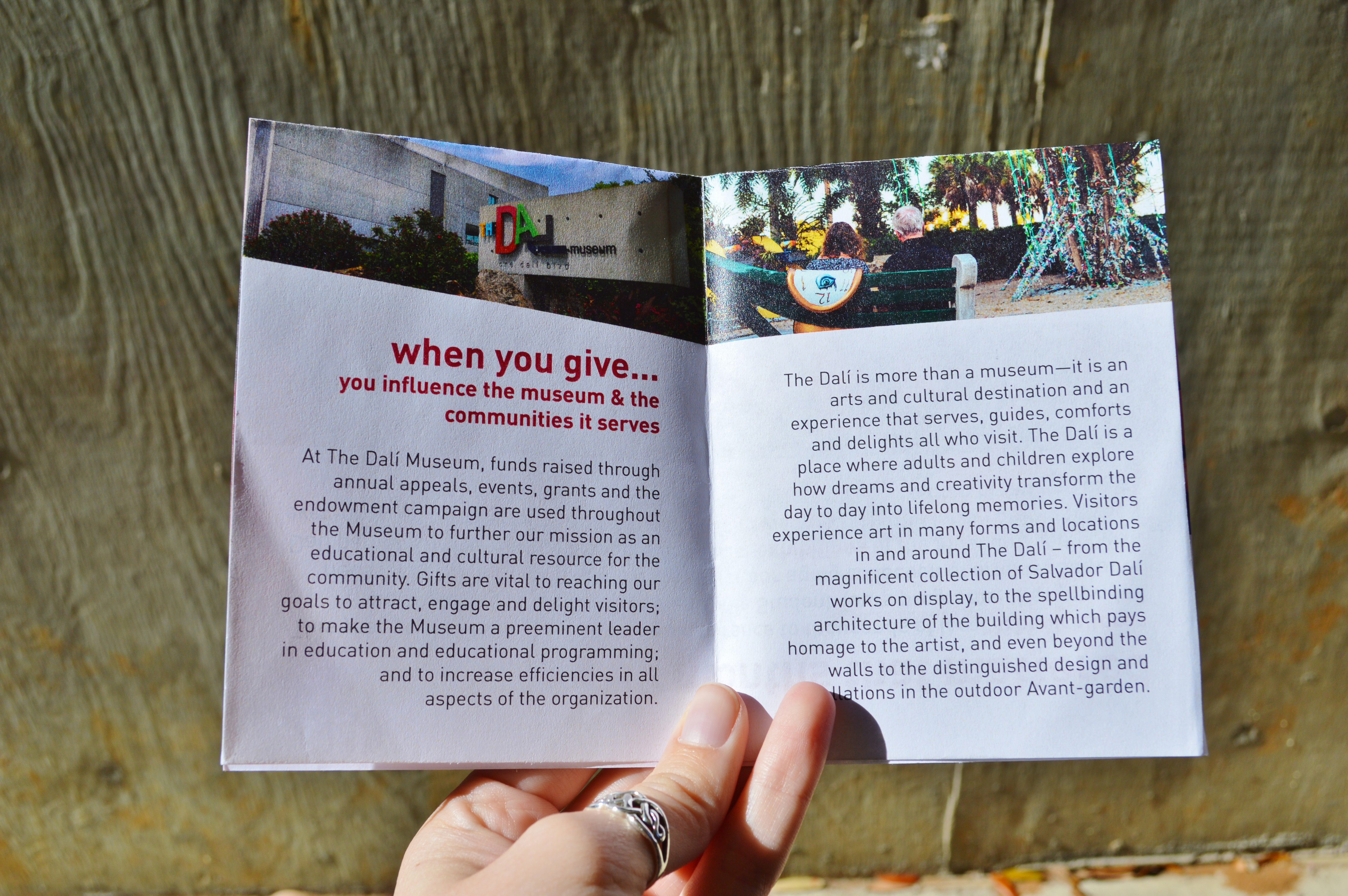
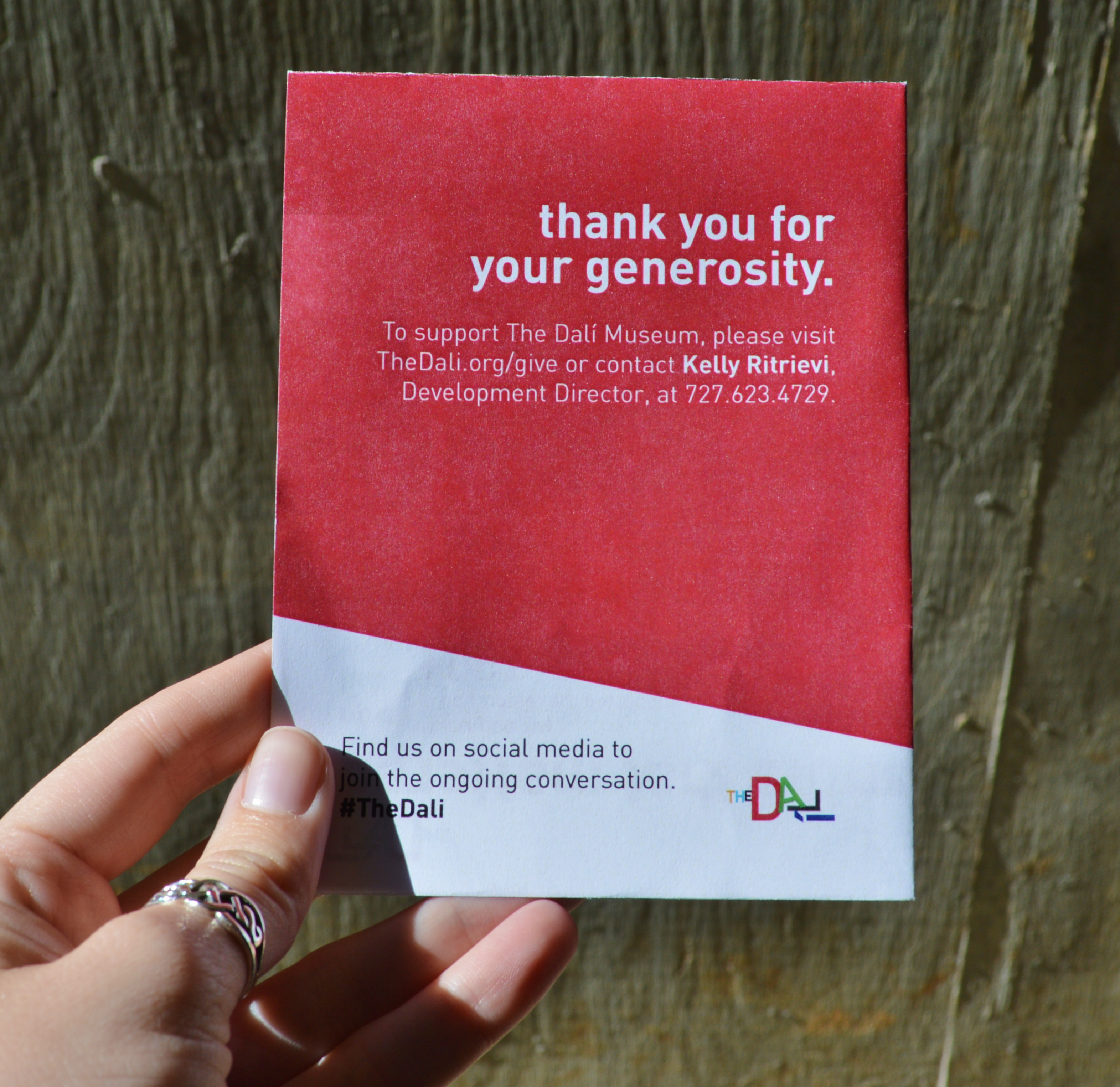
Process: I created this one-sheet as a prototype. It never made it past that phase while I was there, and I'm unsure if it was ever picked up after I left. It was created to be an easy handout which summarizes the information given in a ten-page impact report. I took all of the text from the original report, but placed my own emphasis on some key words. This one-sheet functions as a booklet which can be folded and read, then folded out completely as a mini-poster. We wanted to create a one-sheet which was economical and fully communicated all of the wonderful things accomplished at The Dali with the help of donors. I came up with the layout and most of the design on my own. I was handed the reigns on this project, and I really wish I had been able to stay long enough to see it come to fruition.
Medium: Adobe InDesign and Adobe Illustrator
Year Created: 2017
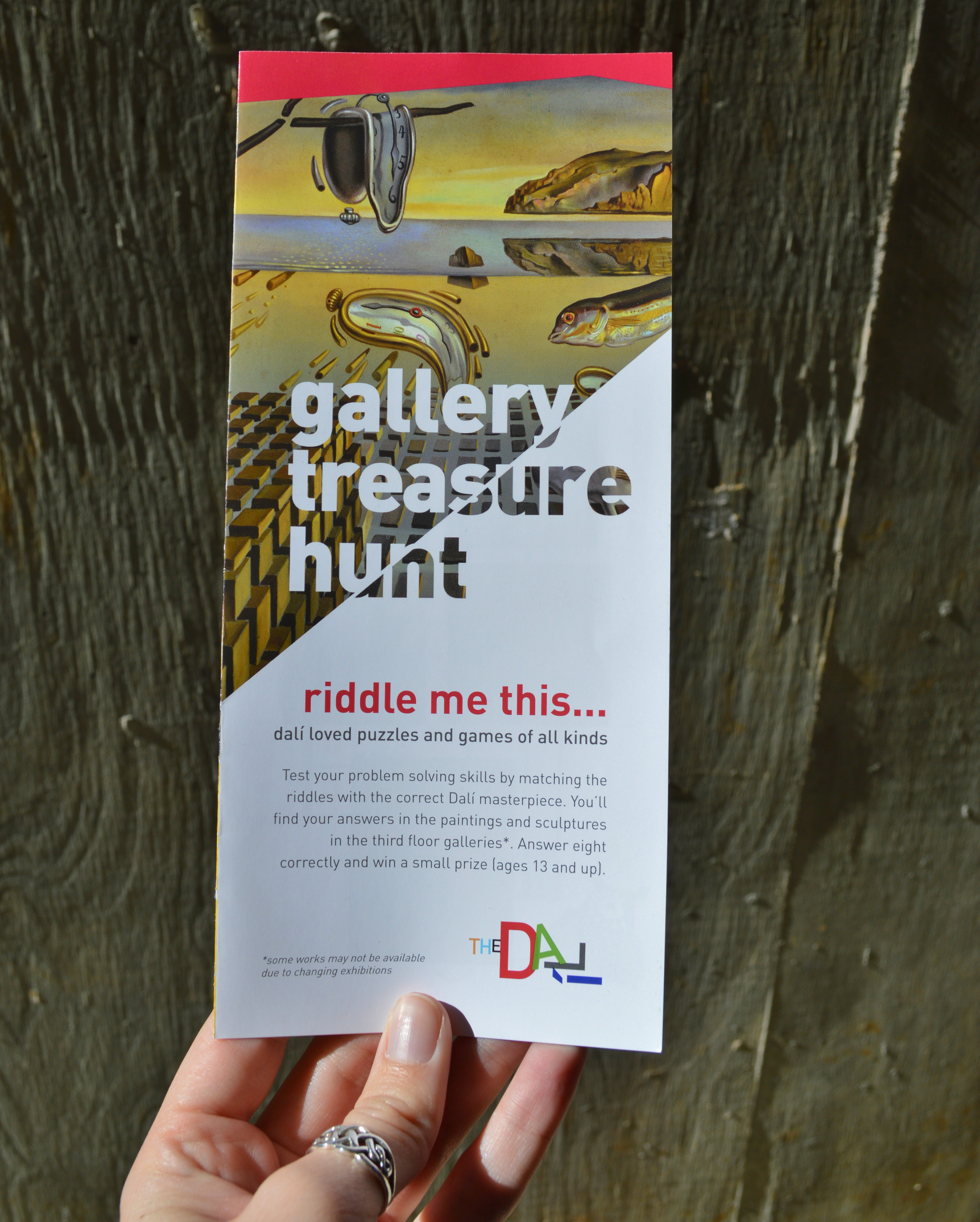
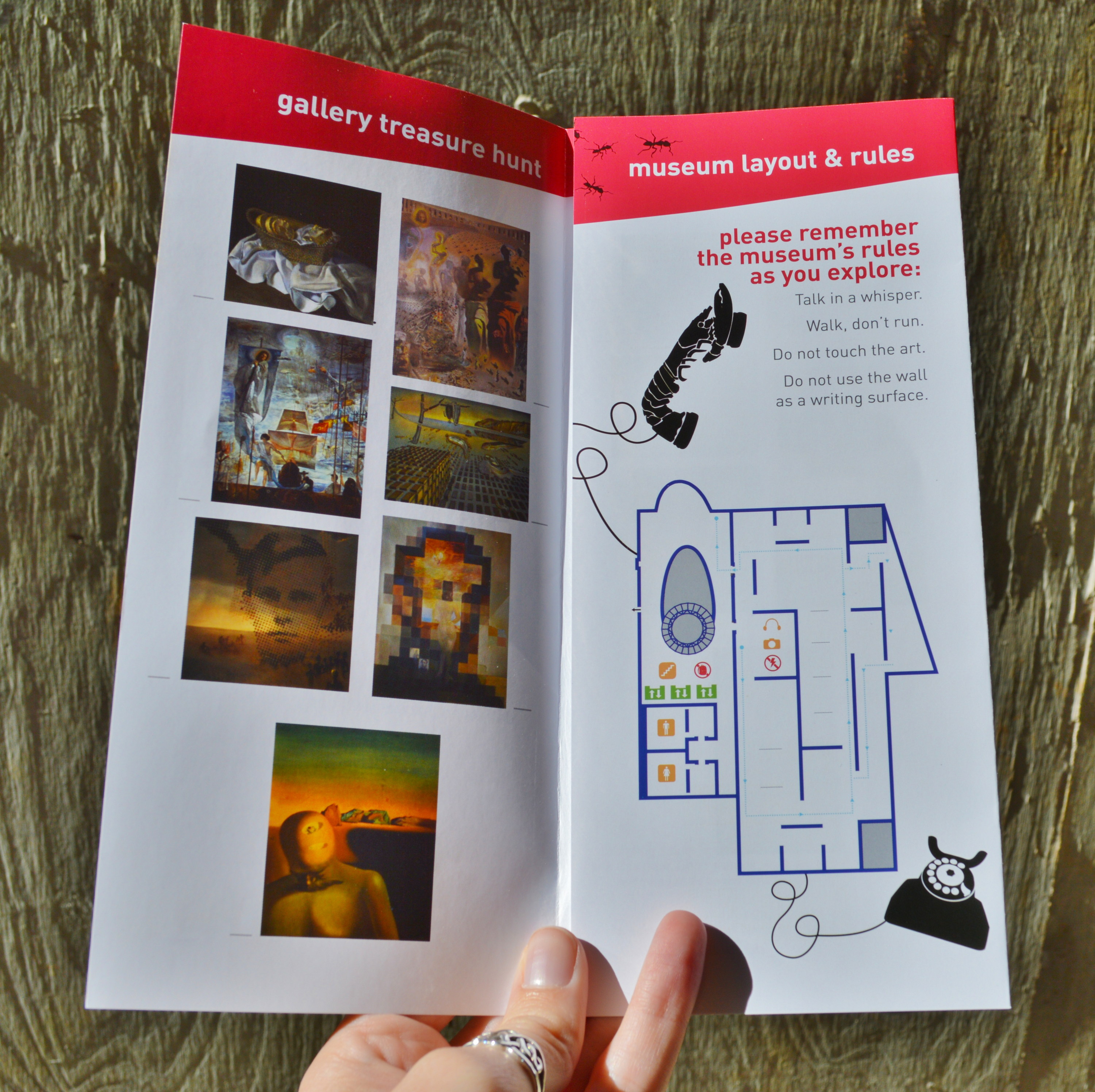
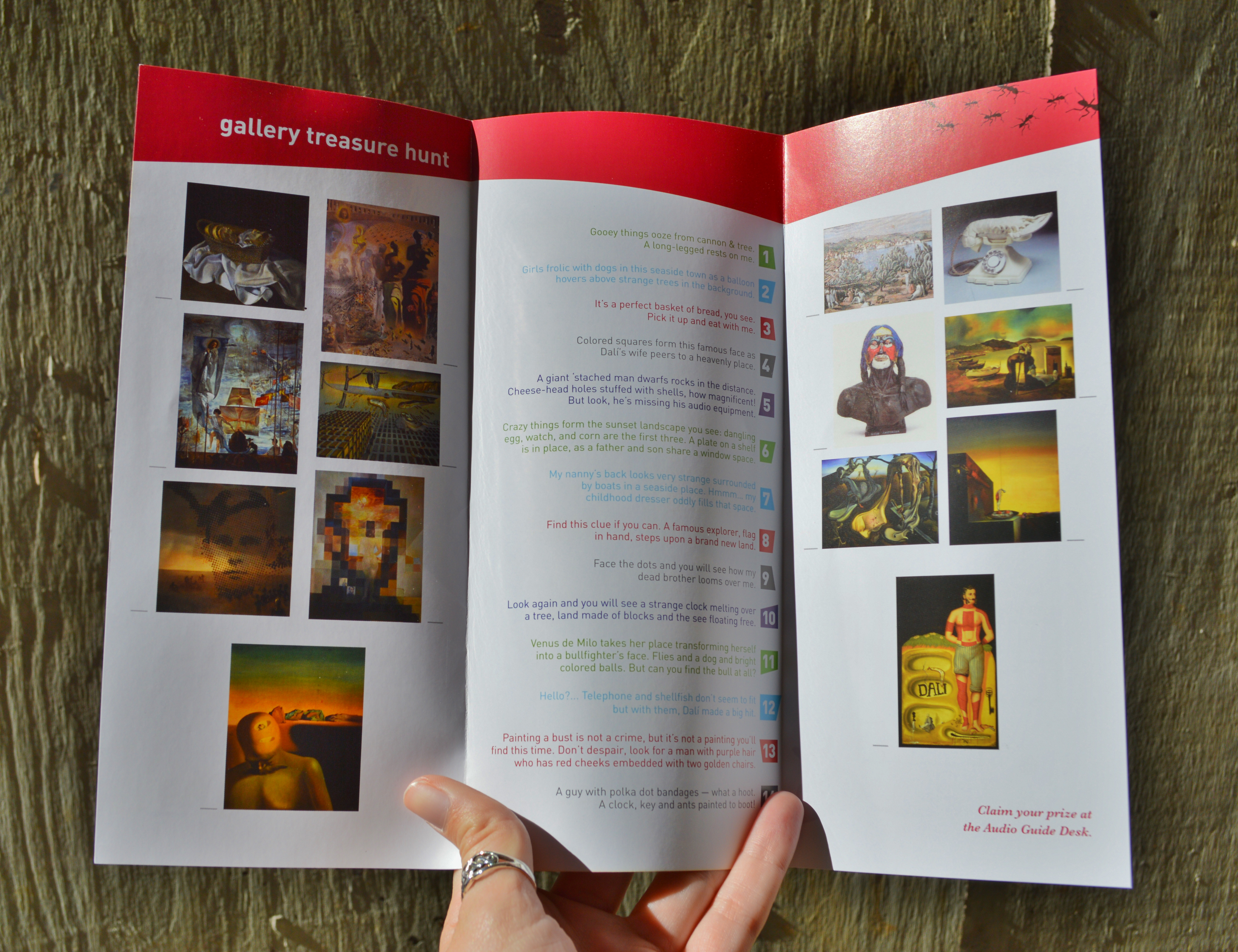
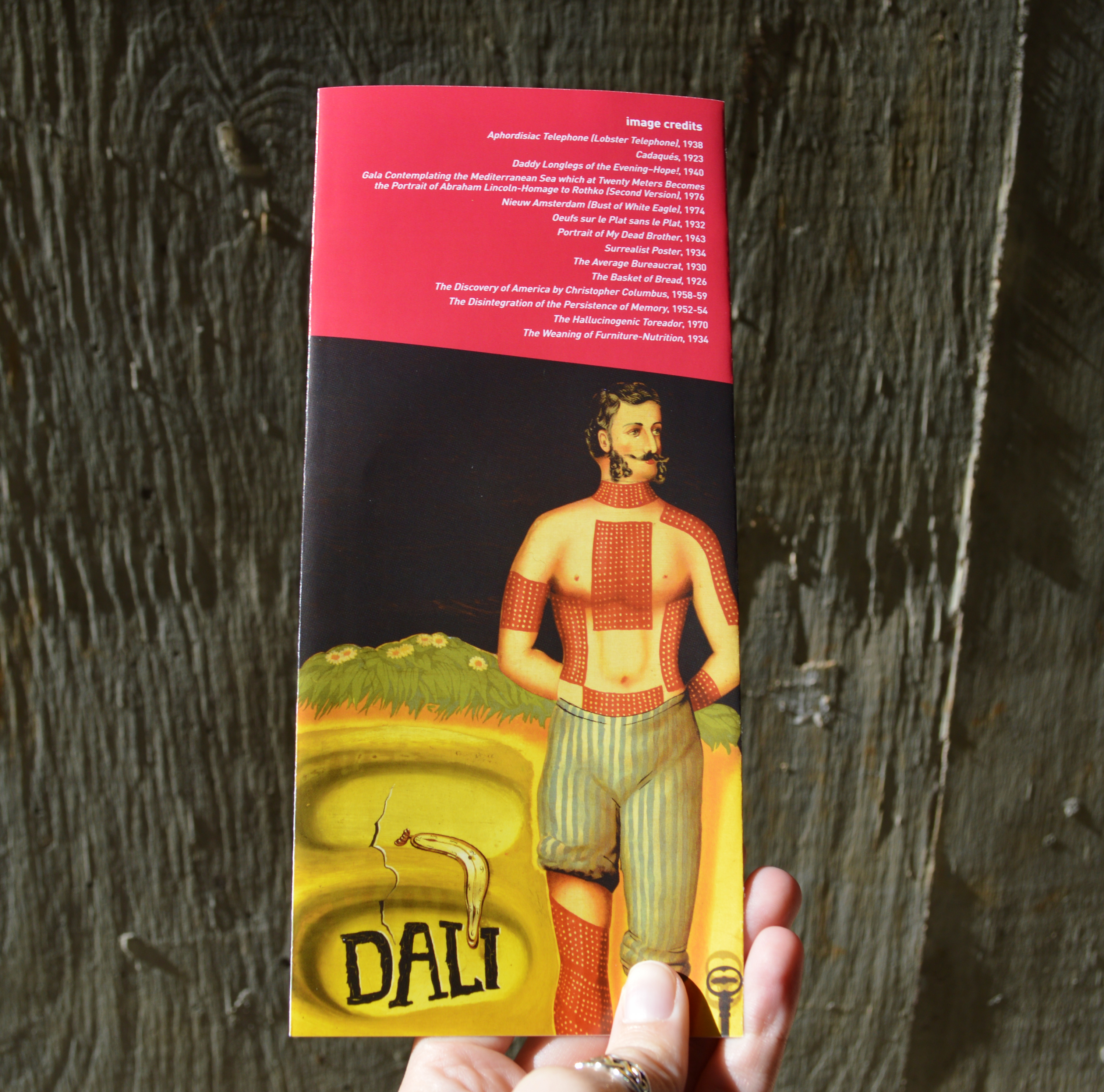
Process: I was given this in-progress project to finish during my time at The Dali. I made extensive changes to the layout under the advice of Julia Howard, the Art Director at The Dali Museum. The treasure hunt went through several redesigns. It is currently available to any children (or adults!) at the audio tour desk at The Dali. It was challenging to make it available in nine different languages: Catalan, Chinese, Dutch, English, French, German, Japanese, Portuguese, and Spanish. This presented unique challenges for the design. The version seen here was replaced shortly after it was printed, after I tweaked the design to better accommodate for the multiple languages to be used. The masthead, while it looks great, proved difficult to produce in nine different languages, so it was eventually changed into just a regular picture. A label for each language was placed just over the "riddle me this..." text, which was later adjusted. This treasure hunt was one of my biggest projects at The Dali. I was so excited and moved when I saw a young girl working on the treasure hunt while touring the Museum.

Medium: Adobe InDesign and Adobe Photoshop
Year Created: 2017
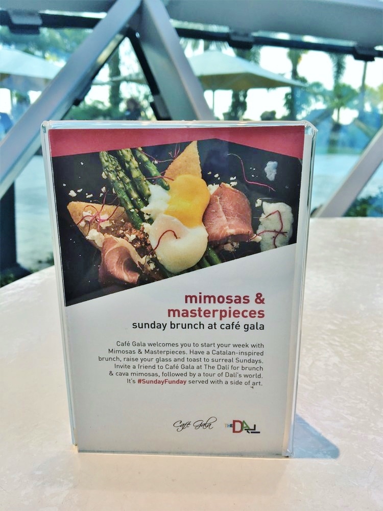
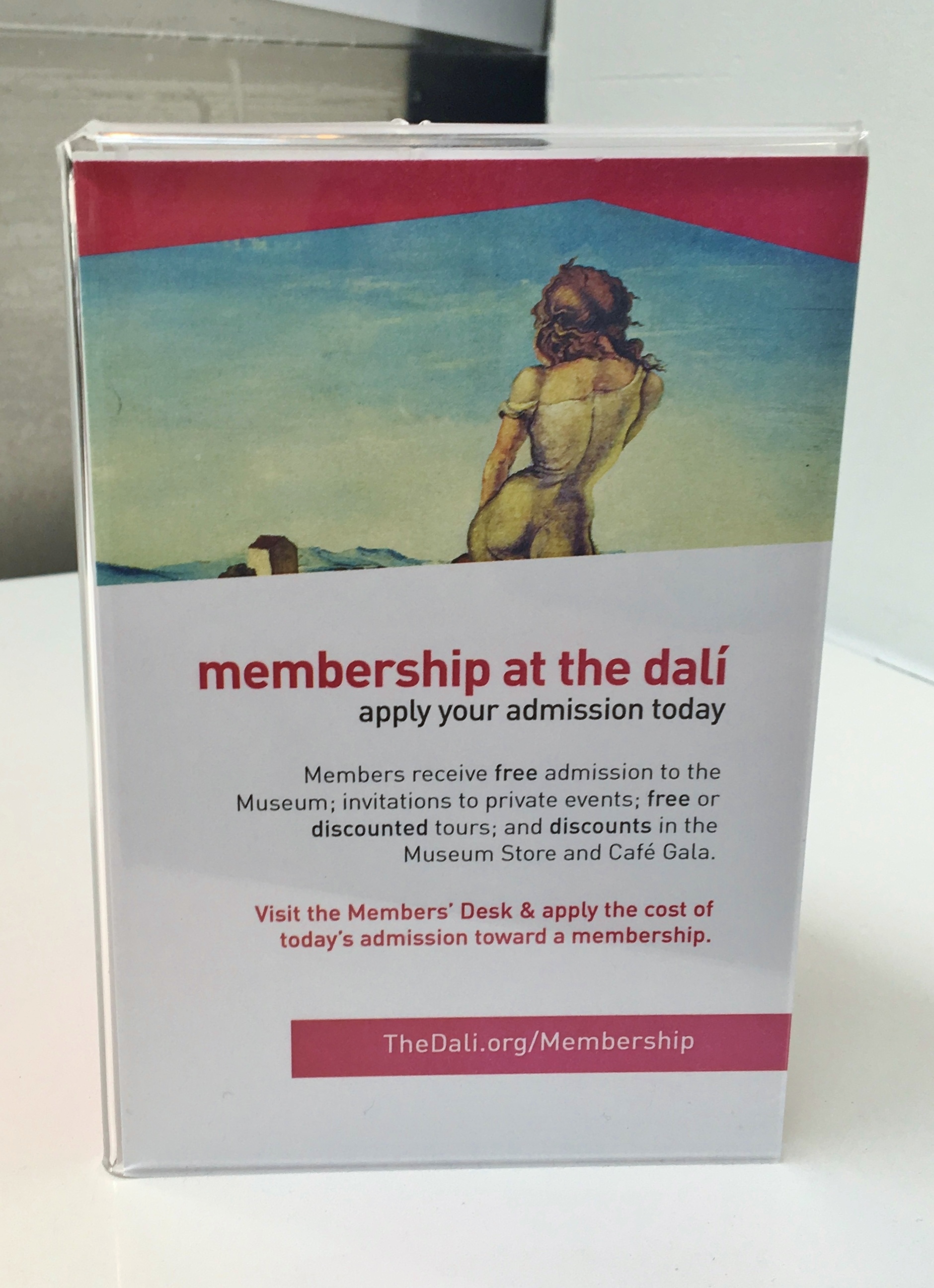
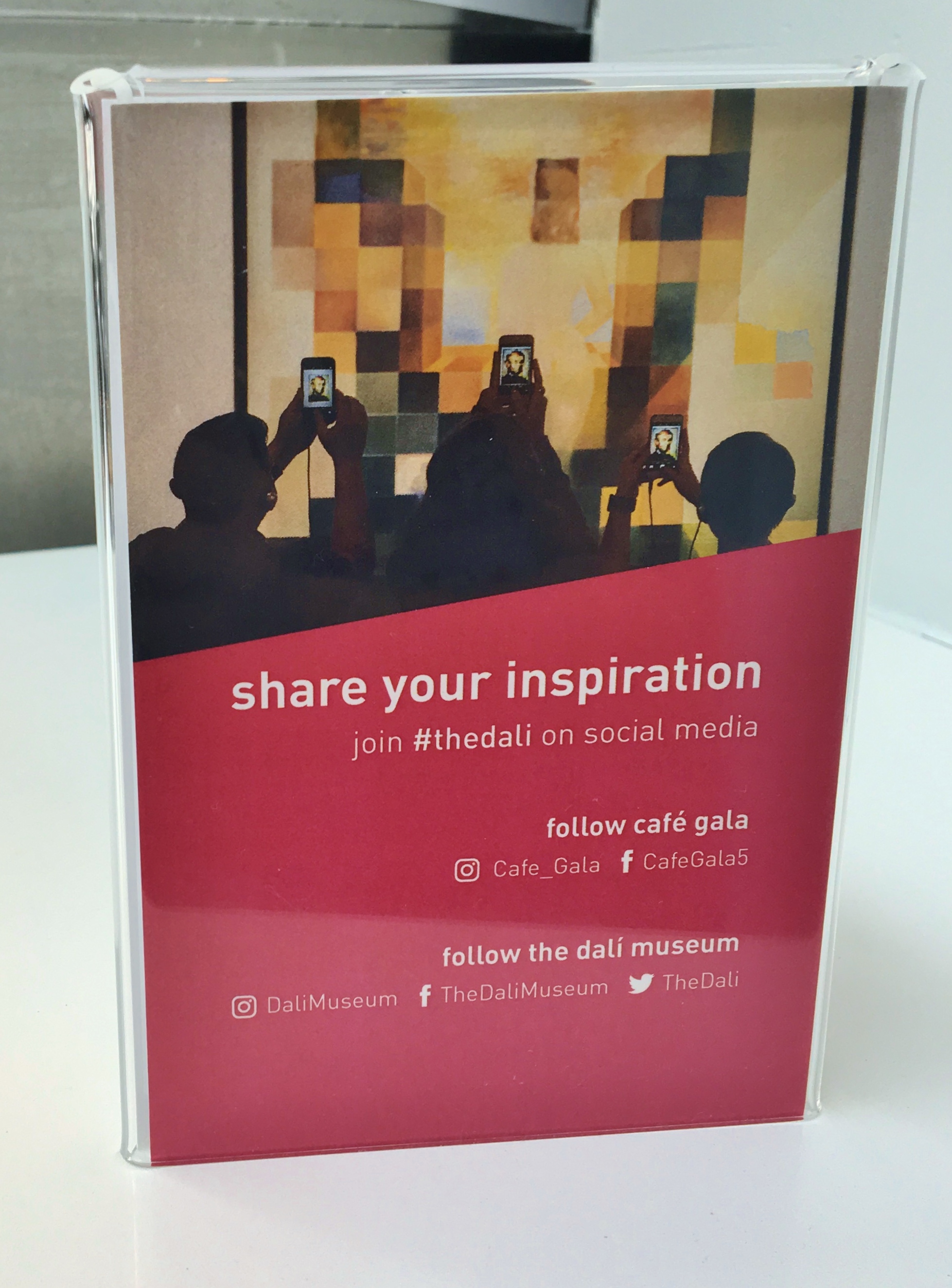
Process: I created these three inserts for a handful of table tents at The Museum's restaurant, Cafe Gala. The inserts advertise The Dali's new app, membership benefits, and The Dali's social media presence, respectively. I also created an insert to bring attention to The Dali's Sunday brunch. Initially, it was not used because the launch of the brunch was delayed, but it has since replaced the insert about the app. These table tents are still on view at The Dali. One of them made an appearance in a photo tweeted by the Dali Museum. I am also hidden in the photo on the social media insert—I'm the person in the middle!
Medium: Komodo Edit 11 and Sublime Text 3
Year Created: 2021
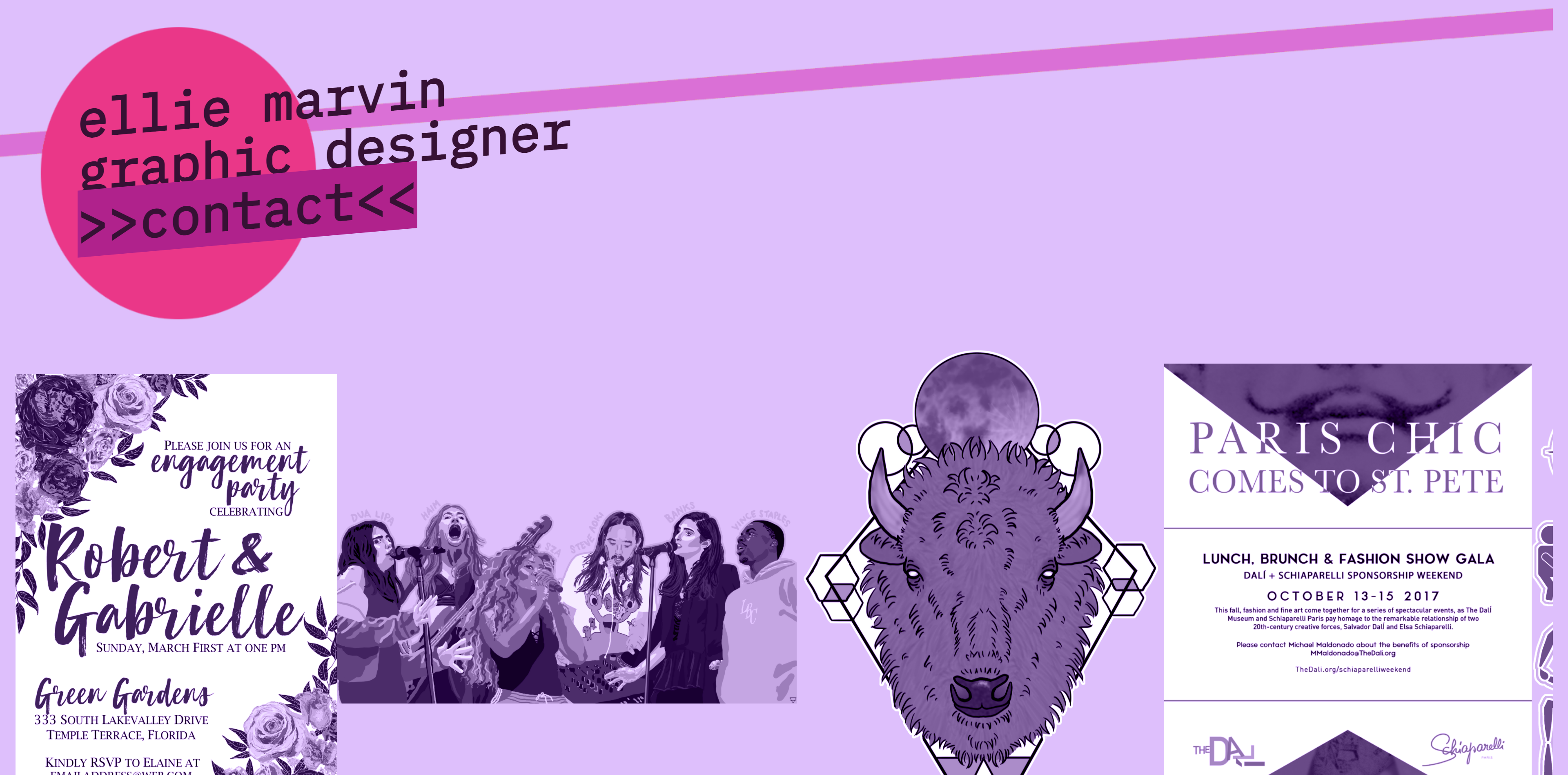
Process: I designed this site as a potential brutalist rebranding of my graphic design portfolio while finishing my Master's degree. I developed an interest in brutalist design and decided to try it on my own site, completely rewriting it to highlight: a color scheme which reflected early 2000s web culture; huge, in-your-face graphics and typography; and fun features, like draggable images, an extra large pointer trail, and skewed images. While this experiment proved to be a fun and useful test of my skills, I ultimately opted to stick with my current portfolio as it is easier to use and less aggressive on the eyes. In this case study, I included links to two different landing pages. I ended up using the first since it is simpler and more accessible, but the second option makes the brutalist theme more obvious and deserves to be shown off as well. I really like the white pixel edges on the animated logo; it feels very brutalist to me.
Medium: Komodo Edit 10
Year Created: 2020
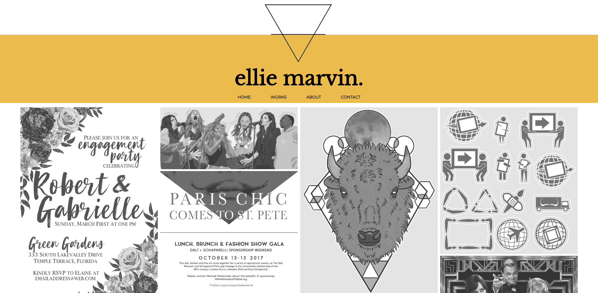
Process: I coded this site myself. It features a very minimalist design and big pictures. The homepage highlights some of my best graphic design work. It also features a responsive design. I redesigned the layout in 2020 to update it to modern design standards. I added the gold streak for interest, created an uneven grid design, and reduced the site to just four pages. I also added a black and white filter to all the images (which vanishes on hover) to make the color scheme more cohesive and create intrigue for users. Above, you can see various stages of the website.

Medium: Komodo Edit 10
Year Created: 2018
Process: I wrote this simple site to showcase my digital artwork. It features a simple color scheme and big, bold, semi-transparent images with full opacity on hover. The design helps to minimize distractions from the art, which stands out especially well on the black background.
Medium: Komodo Edit 10
Year Created: 2017
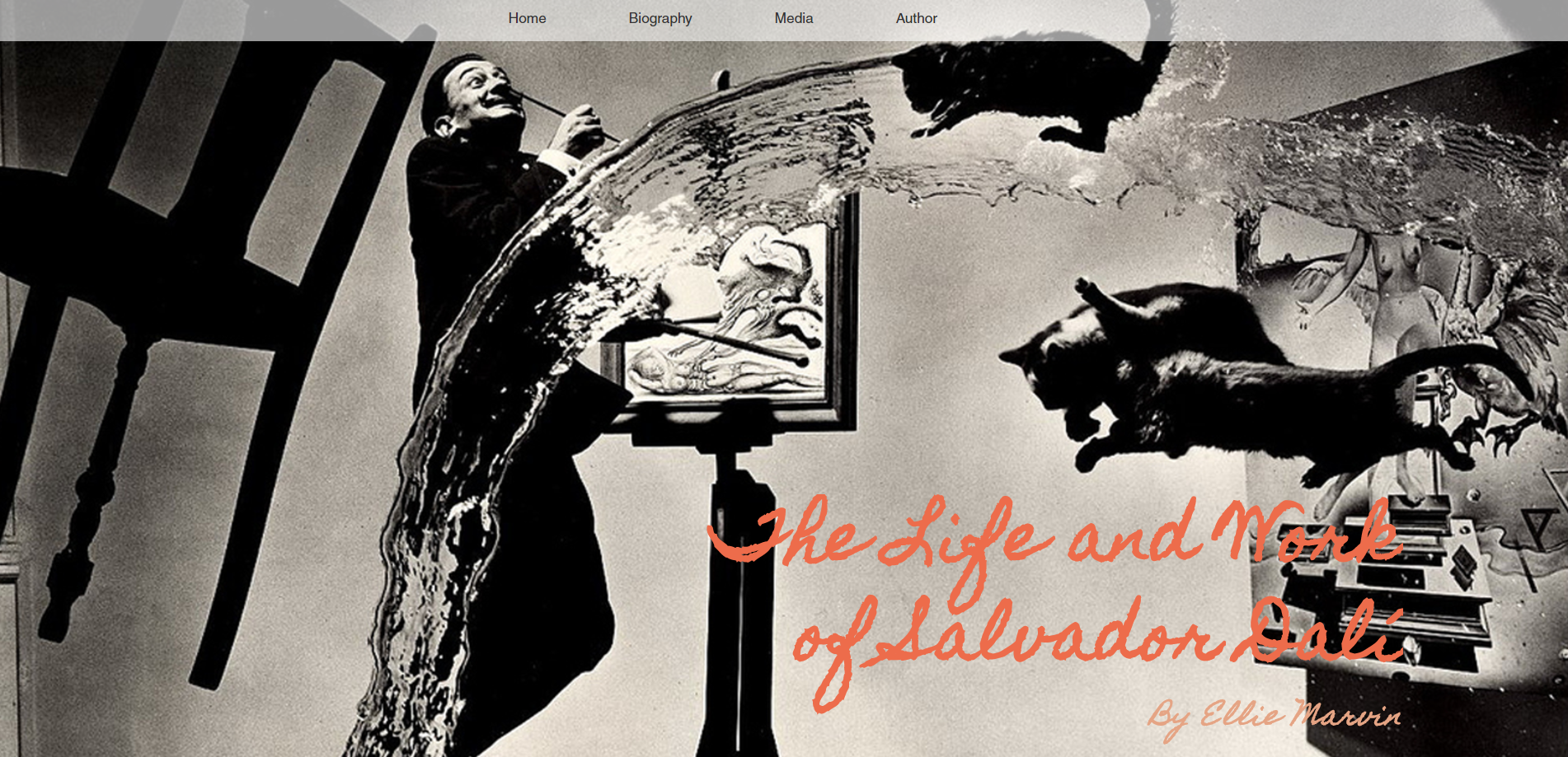
Process: For a web design class, I created this website based around the life and works of Salvador Dali. I wrote about 90% of the HTML and CSS coding, while approximately 10% was provided by my instructor, including the Javascript scrolling effect. The site was coded with responsive design so that it can be viewed properly on mobile devices and tablets. This site has Bootstrap features and JavaScript functions.
Medium: Adobe Photoshop and Wacom Tablet
Year Created: 2022
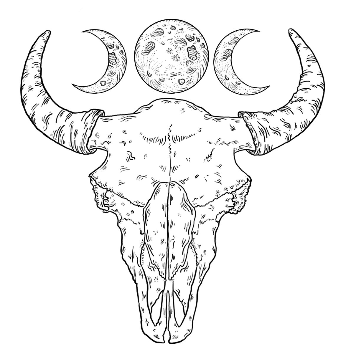
Process: This tattoo was created for a client who wanted a linework tattoo of a bison skull with etchings meant to recall a woodcut illustration. The moons on top were added for balance and to create a smooth transition with another tattoo.
Medium: Adobe Photoshop, Wacom Tablet, HP Pen, and touchscreen laptop
Year Created: 2021
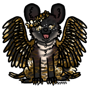
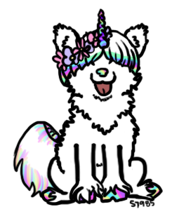
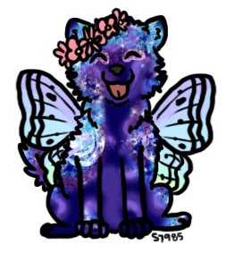
Process: I created these floral canines for a project where I would create custom images based off a similar base. I drew sixteen different bases, over two hundred markings, more than twenty mutations (like horns, wings, etc.), and a handful of bespoke accessories like hoodies and necklaces. The image on the left shows only the uncolored base. I provided a few examples of finished projects above, but to see some more colorful and exciting samples of this project, click here (warning: large image).
Medium: Adobe Photoshop and Wacom Tablet
Year Created: 2020
Process: During the pandemic, I noticed a popular art style arising: semi-realistic portraits with some flat features. I decided to try my hand at this style and created this illustration of the singer Halsey. I decided to make their hair and eyebrows flat black shapes rather than adding dimension, though I rendered the rest of the illustration in full detail. I added a shadow to their hair and brows to offer a little bit of dimension, especially on the forehead area, but left it at that. The peach-colored background matches the blush on their cheeks.
Medium: Adobe Photoshop and Wacom Tablet
Year Created: 2017
Process: Click on the image to view a larger version of it. I drew this illustration for a group project in an English class. We made up a fake concert headlined by an artist chosen by Florida State University students. I made this illustration as a header image for our website and our social media profiles: Twitter, Instagram, and Facebook. The image advertises a few of the choices which students are able to vote for in several online polls. I created the vector-style look in Photoshop by hand drawing each figure.
Medium: Adobe Photoshop and Wacom Tablet
Year Created: 2016
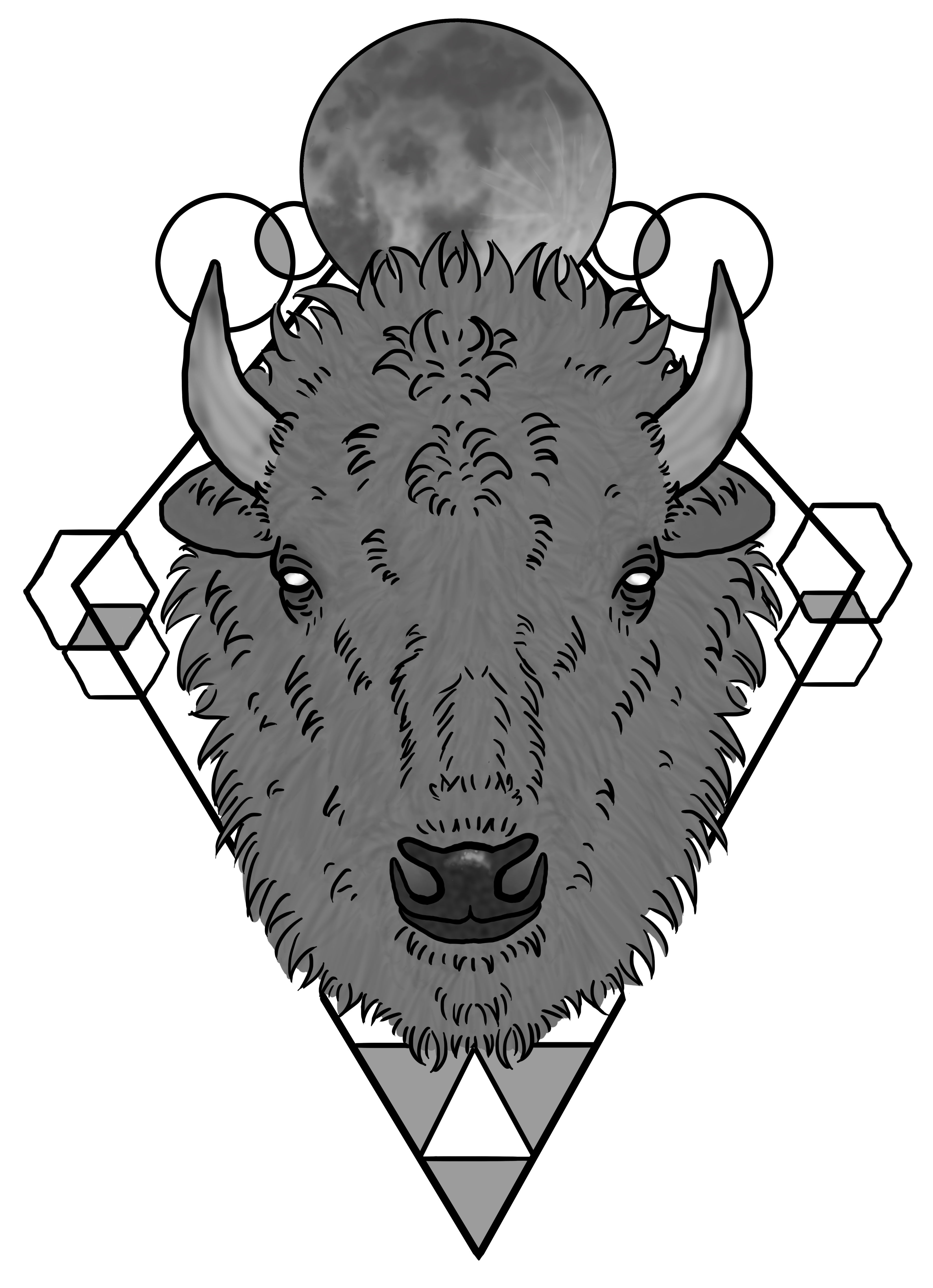
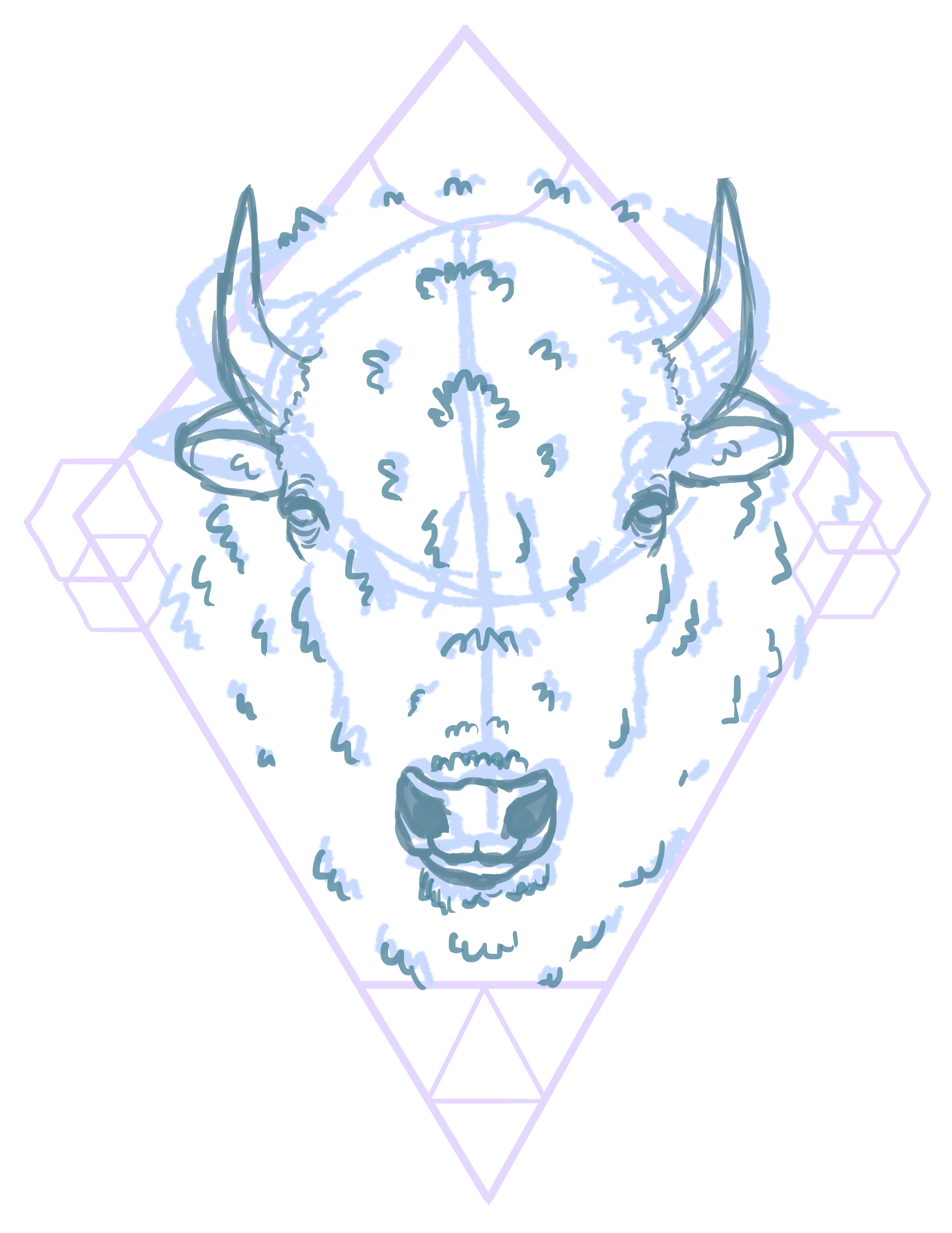
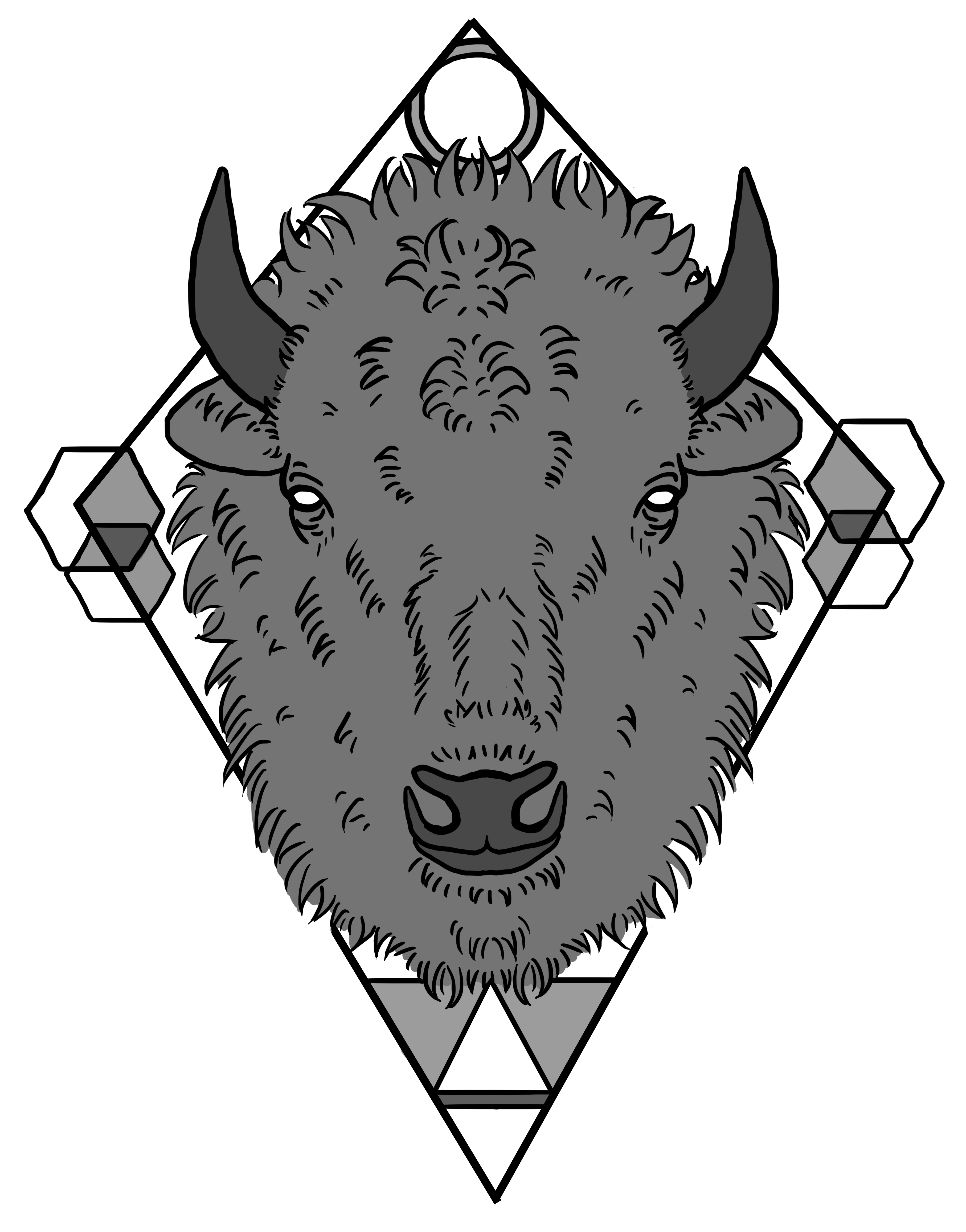
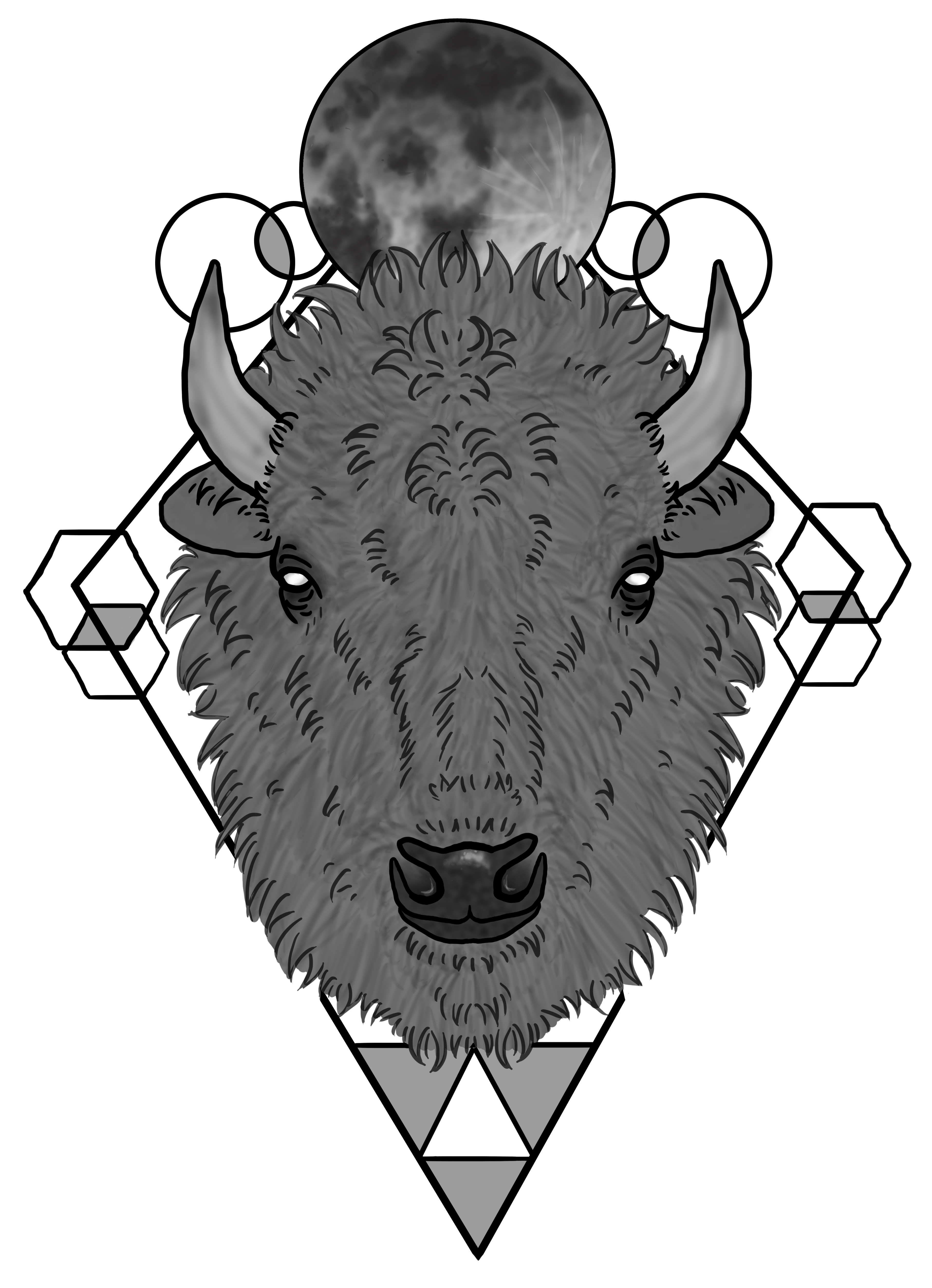
Process: I drew this illustration as a tattoo commission for a client who simply requested a geometric bison. He asked specifically for hexagons in the illustration. I presented him with the bison sketch shown below, and he showed me where he wanted the shapes to be placed. I moved forward with lining the piece and placing flat colors. I suggested to the client that a bigger circle up top may look better, and I added the Moon to the top of the piece. I added some shading and made some small adjustments to the geometry, as per the client's request.
Medium: Adobe Photoshop and Wacom Tablet
Year Created: 2016
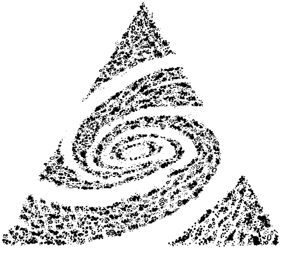
Process: This tattoo was designed to resemble a galaxy in an artistic style (almost mininmalism, and not quite cartoon). The galaxy fits loosely in a triangle shape, with some stars peeking out.

Medium: Adobe Photoshop and Wacom Tablet
Year Created: 2016
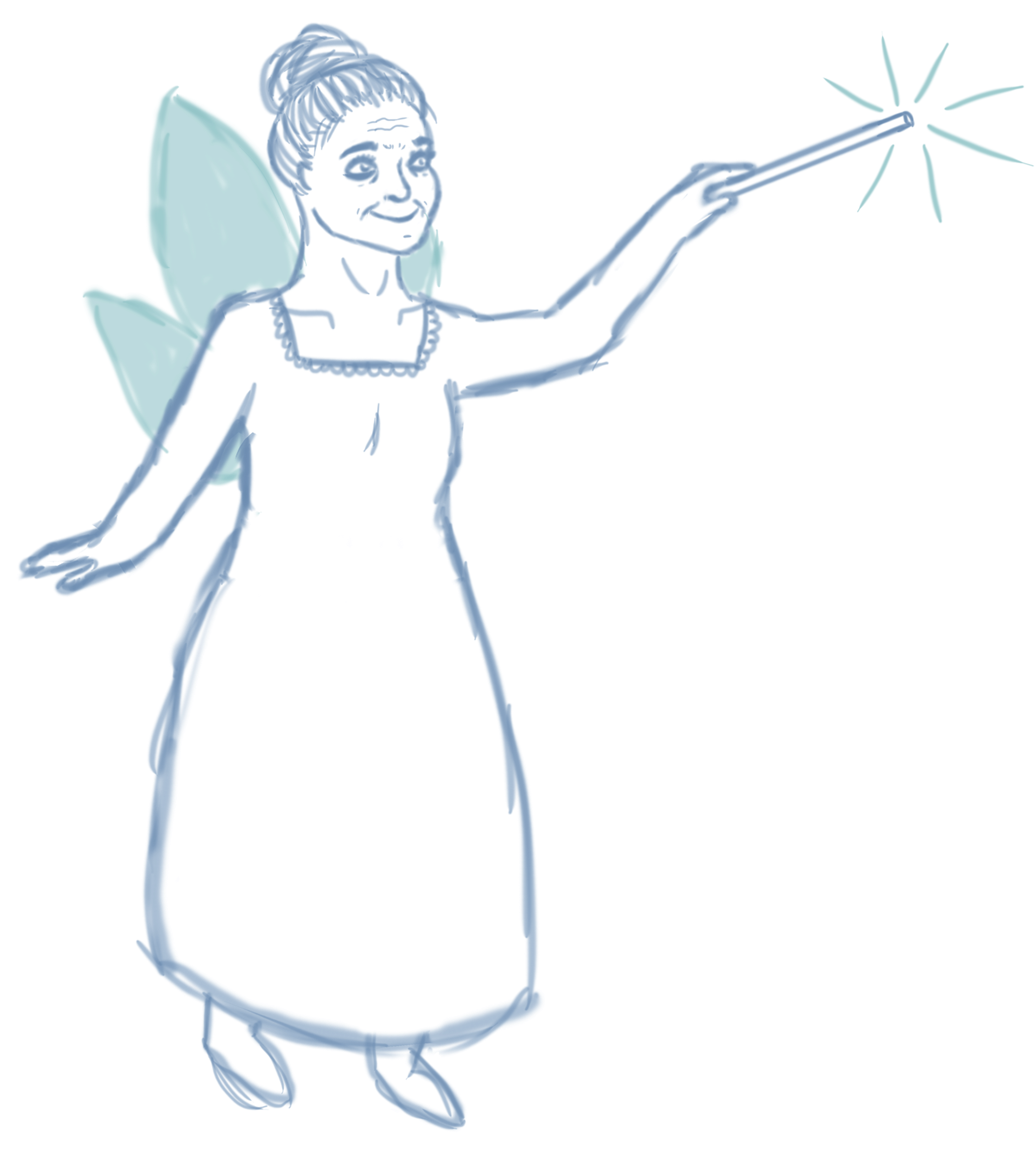
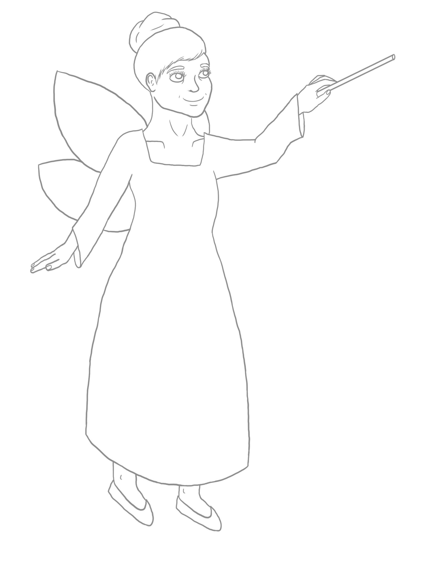
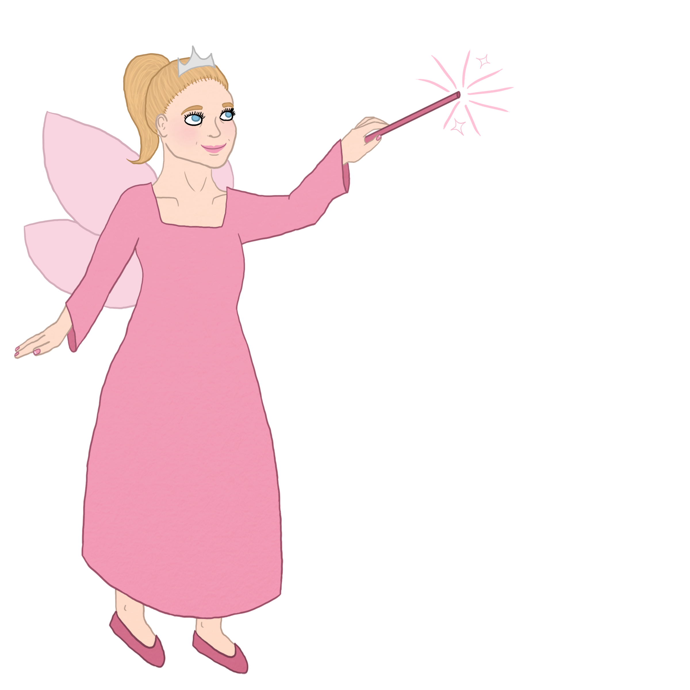
Process: I made this simple illustration, featuring semi-transparent wings, for a client who requested a fairy godmother. Below is my process. I began with my initial sketch. From there, I moved on to hard outlines, which I sent to the client for notes. The client requested some changes, mainly to make the godmother seem more youthful. However, the godmother then seemed too young for the client. We settled on a godmother who appeared to be in her 50s, so the final version of the illustration was created. It is very important to me to always deliver a product which the client is fully satisfied with.